
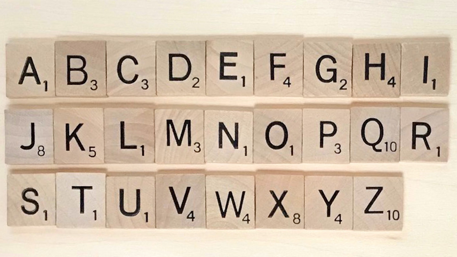
Scrabble Letter Tiles Are Eurostile
The official Scrabble history page talks about how they stamped individual letter tiles at first, but there’s no specific mention of which font they chose. We reached out directly to Hasbro, makers of the Scrabble board game, and they told us that the official font for Scrabble tiles is Eurostile.
Originally designed by Aldo Novarese in 1962, Eurostile is a geometric sans-serif font. You’ll find it on signage and even in science fiction artwork, evoking a sense of functional, modern architecture. The emphasis is on straight lines with smaller rounded corners.

Official Scrabble Game Font Is Interstate Bold
Some people might assume that the Scrabble letter font is the same as the Scrabble game font, but that’s not actually true. The font used on the Scrabble board squares themselves, like “triple word score,” is not Eurostile.
Hasbro says the Scrabble game board font is Interstate Bold.
Tobias Frere-Jones designed the Interstate typeface in the 1990s. The font is based on a signage alphabet drawn for the US Federal Highway Administration in 1949. In this way, Interstate and Interstate Bold share the “great for signage” characteristic of Eurostile. It’s also great for print displays, as would be the case with a game board.

Alternative Scrabble Letter Fonts
Prior to receiving the official word from Hasbro, we embarked on a bit of detective work to determine what font is used for Scrabble tiles. Inspecting individual tiles, including the Scrabble letter values, we find that the Scrabble font is simple and clean, emphasizing legibility. It’s a sans serif font with almost no adornment.
If you’re unable to find or use Eurostile (or Interstate Bold), these fonts may be suitable alternatives to consider.
Futura Font Family
Several online users have suggested that the Futura font family in general (and Futura Bold in particular) could be the official font for Scrabble tiles. However, that’s not quite right. In Futura, both diagonal strokes in the letter K go straight into the vertical line. On the K tile in Scrabble, the lower diagonal stroke intersects with the upper diagonal stroke.

News Gothic Standard
Quora writer Ananda Das, who “has been learning about fonts and typography for 50 years,” offers a different suggestion. He thinks News Gothic Standard is closest to the Scrabble letters tile font. When you look at some letters where we’d get the greatest variation, News Gothic Standard seems to hold up. Look at the letters G, K and Q in particular. That looks to be a pretty good match!

Franklin Gothic
Shelly of 100Things2Do decided to take on a Scrabble tile DIY project for wall decor. Like us, she found online sources saying the font for Scrabble letters is Futura Bold. She also found that it wasn’t quite right. Instead, she found a “closer match” in Franklin Gothic. As with News Gothic Standard, Franklin Gothic offers a good match on letters like G, K, Q, and R.

Old UK Version of Scrabble: Modified Peignot
There isn’t just one version of Scrabble with just one set of letter tiles either. To date, 69 different Scrabble sets have been created, covering dozens of languages from all around the world (and beyond). There’s even a Klingon set!
A member on Typography.Guru asked about the Scrabble tiles “in the old UK version of the board game.” The font is decidedly different from the standard Scrabble set from above. The letters have asymmetrical strokes, like how the left side of the letter A is thinner than the right side. The C is also thicker on the vertical portion than on the top and bottom.
Users on that site seem to agree that the old UK version of Scrabble uses a modified version of the Peignot font. The typeface is similar, but not identical.

Custom Digital Fonts for Scrabble
One more curve ball. The physical letter tiles of a physical Scrabble game aren’t necessarily replicated in exactly the same way for digital versions of the game or in Scrabble-inspired creative design.
The Scramble font by Byte-sized Computing gives us the “feeling” of Scrabble and it shares some characteristics with Eurostile, Franklin Gothic, and News Gothic Standard. At the same time, the strokes appear rounder with rounded tips. ScrambleMixed by Character, on the same page, offers a similar approach.

Scrabble Is a Game of Specifics
In Scrabble, every detail matters. Whether it’s the official font for Scrabble letter tiles or the color of each bonus score square, every aspect of the game is deliberate. One of the more crucial details is the layout of the game board itself. The dimensions and the number of squares on the Scrabble board influence every strategy you use while playing. If you’re a serious player, it’s important that you know exactly what you’re working with.
Michael Kwan is a professional writer and editor with over 14 years of experience. Fueled by caffeine and WiFi, he's no stranger to word games and dad jokes.
